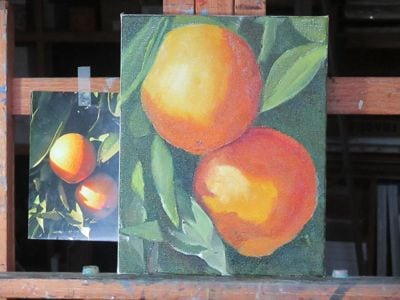
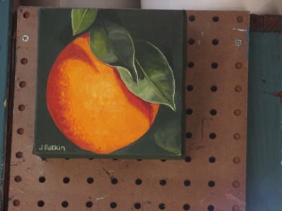
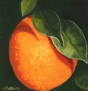
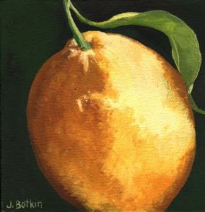
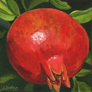
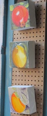
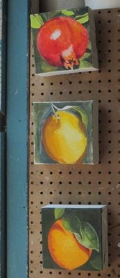
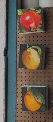
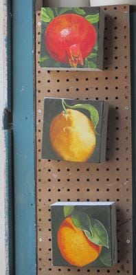
My friend/customer LOVED these paintings, including the extra thick canvases. Yea!
However, I studied the orange painting and realized it isn’t symmetrically round like an orange – it is squished on the left side.
Back to the easels. . .
My friend/customer LOVED these paintings, including the extra thick canvases. Yea!
However, I studied the orange painting and realized it isn’t symmetrically round like an orange – it is squished on the left side.
Back to the easels. . .
Do you ever wonder about the origins of sayings such as “jumping the gun”? That is an easy one – it refers to racers (horses? people?) who take off before the starting gun.
In commissions, the “starting gun” is when the customer pays 1/2 down and we decide exactly what she wants. A conversation alone is not the starting gun.
I have had a recent wonderful reunion with an old friend (we are actually middle-aged, not old, and think we met in 4th grade but can’t remember). She expressed an interest in some fruit paintings. We didn’t decide anything for sure, and I didn’t even have the right sized canvases.
But, I’m having a hard time focusing and pushing through and following up. Sometimes life is hard, and it robs one of the ability to do everything one normally would do. Sometimes when life is hard, one just takes the easiest route.
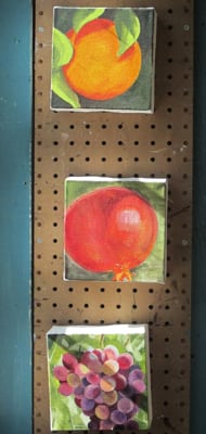
(LBWR, feel no obligation for these 3 paintings – I just felt like tackling the project even though the canvases are thicker than the ones you saw and we didn’t cement the final look. If they don’t suit you, I’ll schlep them around to my fall shows, and I will still paint yours however you would like.)
First pass – wow, these are thick canvases. Next, effort into the orange because it got short shrift last time.
Looks good, and the colors are easy to morph into lemon colors. Wow, that pomegranate looks awesome, if I do say so myself.
“If I do say so myself” – where did that ludicrous saying originate? I did say so, myself.
LBWR, what do you think of these? I will be painting the sides dark green so they won’t need frames.
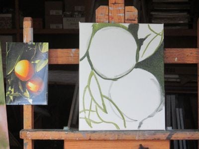
On Thursday, I left you with a cliff-hanger of a green orange. (Reminds me of the time my mom wanted to show orange trees to her 4 year old Kansas granddaughter. “Look Ashley, those are orange trees.” “No they aren’t, Grandma – they are green!”)
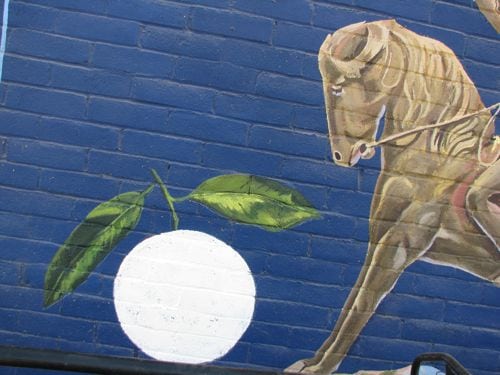
White paint is opaque. Put down white paint, and then paint the orange! Sometimes I just floor myself with my on-the-spot innovations. Honestly, I often have to ask Trail Guy, but I forgot my old flip phone with a broken hinge so I couldn’t call him.
That looks weird. Gotta confess that it crossed my mind to paint it as a baseball. (It was the day that the Giants won the National League to go to the World Series.) As fun as that would have been, it would have meant that I needed to return, and I wanted to be FINISHED with this project. After all, I started the mural at the beginning of June.
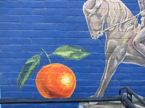
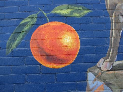
Yes! The orange is done.
It looks good! The owners were right to add an orange.
I couldn’t photograph the entire mural because the pickup was blocking.
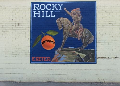
I spoke to one of the owners about adding the word ANTIQUES to the side of the mural. Together we concluded that it falls under the heading of sign, and under the skills of a sign painter. I am not a sign painter; I am a mural painter. The mural is finished.
May it be so.
We are waiting for the heat to end so I can finish the Rocky Hill Antiques mural. September passes. October arrives. The heat continues. FINALLY, last week, it mellowed from the 90s to the 80s. Practically sweater weather around here!
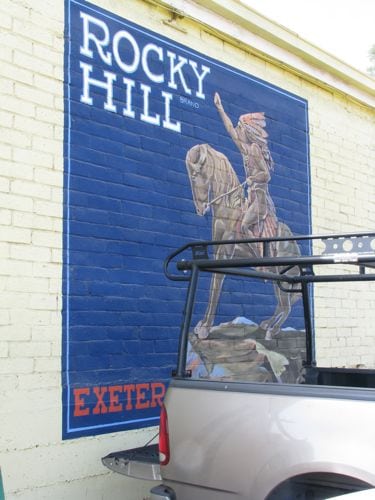
Wow, the mural is dusty and has some spider webs. No worries, I’m a country girl. “Girl”. Old girl. Never mind. An overall wearing man who works at Rocky Hill Antiques offered to back his pickup to the mural so I could paint from the tailgate. Perfect! He said he’d worked off scaffolding and ladders enough to know that it’s not easy. He was right, and I REALLY appreciated his help.
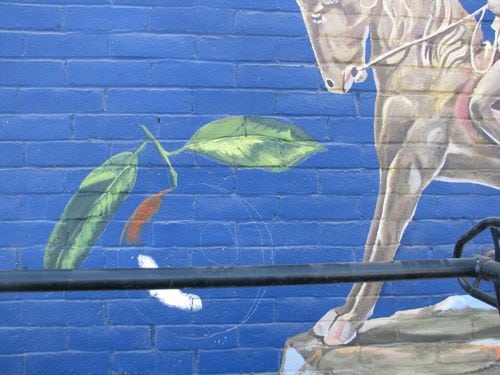
First step: draw the orange.
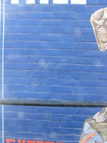
Can you see the chalk? When I backed up, I could see that the orange was too squished, so I added a bit to the right side. The leaves were also too short. They didn’t look bad, but my instructions were to follow a certain orange, not just go hog wild. (Guess I could say “off the reservation” since the mural contains the “Indian Outlaw”.)
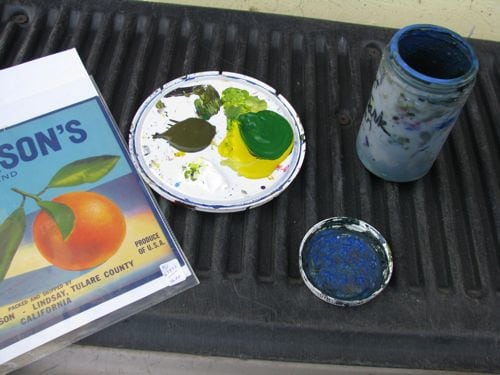
First, I mixed some greens. There is a good dark green in that plastic jar. I didn’t put any on the palette because it dries out too fast that way.
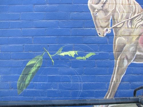
First leaf finished, second leaf begun. Notice the headache bar from the pickup? I didn’t hit my head once!
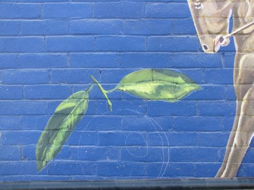
Two leaves done! Now, time to mix the orange paint.
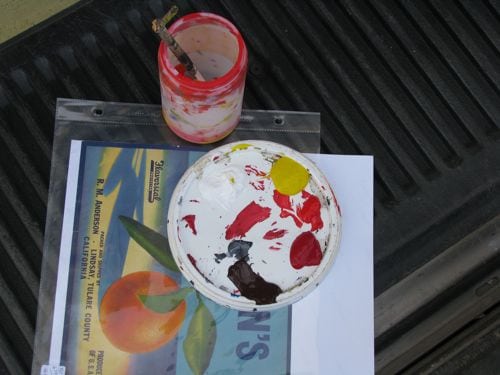
I premixed the basic orange in the plastic jar, then added white, yellow, 2 reds and a brown to the palette. By the way, the “palette” is a lid to a paint bucket.

Houston, we have a problem. The paints are transparent, or maybe the word is translucent. Whatever it is, they are see-through. This means with the orange paint that is mostly yellow placed on top of that blue, it goes all green! This is supposed to be a ripe orange, not one that is waiting for cool nights to arrive.
What am I going to do??
Come back on Monday, and I’ll show you. Why not tomorrow? Because Fridays are for Mineral King on this blog.
I showed my favorite view of the potential revision/addition of the Rocky Hill Antiques mural to the owner. He still wanted the word “ANTIQUES” included. I tried to convince him that the word would change a mural into a sign, and there is plenty of signage at the business with no doubts at all as to what the business is about.
But, the owner requested the word ANTIQUES, so I showed him some alternatives. He liked this typestyle. I still thought the word didn’t belong in the orange.
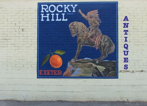
How about if we move the type outside of the mural?
Finally, the owner said that would be okay, but he liked the larger orange.
Bigger orange, like this, minus the word in the orange, and added to the outer edge.
Phew. Now all I had to do was wait for the heat to abate.
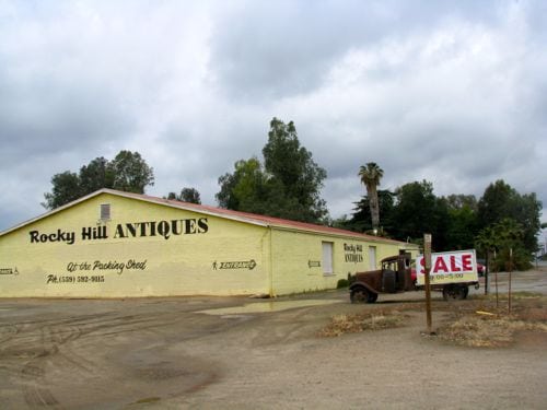
Remember the mural on the side of Rocky Hill Antiques? I painted it last June. Here are the links to the posts about it:
Projecting A New Mural, Chapters two, three, four, five, six, seven, and eight
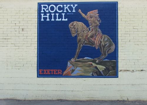
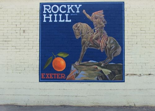
The mural looked like this at the end.
We simplified it from the original label, which was full of words and a cellophane wrapped Sunkist orange. After simplifying, my customers decided it was too plain.
By that time, it was summer and definitely too hot to paint on a wall that collects heat all morning. There was much discussion, and eventually the owners decided they wanted an orange added with the word “ANTIQUES” on the orange.
This is Exeter, California, an orange-growing mecca, and this is an orange grower’s label.
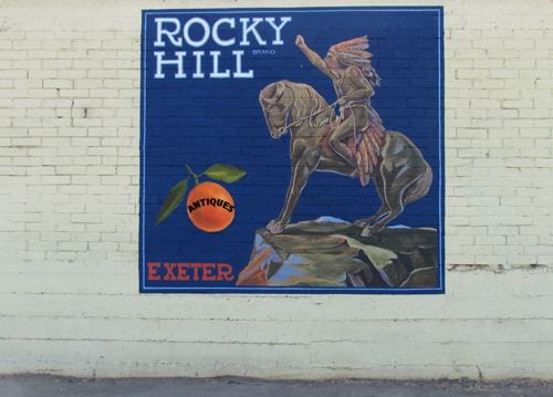
I used the orange off a label provided by the store owner and Photoshop Elements to try to illustrate what I thought they were requesting.
They may have requested a larger orange, or perhaps I just decided to try one.
The word in the orange just doesn’t belong. Of course that is my opinion, not an absolute truth. The customers’ wishes are supposed to take precedence over the artist, or are they?? Hard to say. . . I am a hired painter, but I do have a little pride in my work.
Let’s look at my favorite version.
This suits me. However, it still didn’t suit the owners.
What’s an artist to do??
Wait. Wait for a better idea. Wait for the heat to abate. Wait for inspiration, for something.
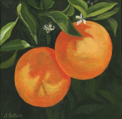
Blooming Oranges #2, 8×8″, oil on wrapped canvas, $125
Taste the Arts is the name of a street fair type event in Visalia. It is very extensive, with lots of opportunities to try different methods of making art. There will be demonstrations in spray paint, stenciling and murals, along with lots of artists exhibiting and selling their work.
Here is their link: Taste The Arts
I participated in an early version of this show about 2 years ago. The Arts Consortium is the most organized group I’ve ever had the privilege of working with, and I expect this event to be great!
As a Central California artist, there are certain subjects that dominate my painting life.
If you have read this blog for any amount of time, I bet you can guess.
If you are new to this blog, welcome! You don’t have to guess because I am about to show you.
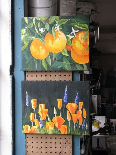
These two 11x 14″ paintings, citrus (or oranges, if you prefer) and poppies (or poppies and lupine) are drying on the wall in my painting workshop. I think the poppies painting wants more foliage. I could ask it, but instead, I’ll ask you. My chances of hearing something useful are better coming from you.
The commenting process on this blog is annoying. I think if you comment, it will tell you it didn’t go through. This is because it lands in a spam folder and then I have to “moderate” the comment.
Anyone want to try?
Thanks!
I am the daughter and granddaughter of citrus growers. I thought I might become a citrus grower myself, but I became an artist. Still self-employed, but in a much less risky and less regulated business. Still, I am inspired by citrus.
Usually I paint oranges as a still life, which means an orange or two on a table-top. Now I am painting 4 or 5 oranges on a table top, but it is the easel that is on the table top.
never mind. . . worry does strange things to my writing ability
If the colors look juiced up to you, it is a combination of the fancy-pants lights and the fact that the colors are indeed juiced up a bit.
“Juiced up” is the term I’m using to mean a bit over-bright or exaggerated. I’m finding it fun to do this. Just a phase or a new way of painting?
Dunno. Just looking for some fun.
Don’t worry. Be happy. Happy happy happy.
There! Don’t you feel better? A California artist has got to paint oranges!
For some reason, it embarrasses me to admit this. So, I put it as the title of this post – practice saying it, feel it, face it. (Say it loud, say it proud?) I am a California Artist and I love Tulare County! (Is it warm in here or is it just me?)
Oranges #121, 8×10″, oil on wrapped canvas, $90, available here
My cousins visited from Northern California. She is from the Chicago area and he grew up near Buffalo. (They are married so I consider him to be my cousin too.)
We spent part of a day in Sequoia. This is where they met while working for The Park’s concessionaire. (Here in Three Rivers we refer to Sequoia National Park as “The Park”.)
Sunny Sequoias XVIII, 8×8″, oil on wrapped canvas, $75, available here
Girl Cousin has inherited a portion of an orange grove where I spend the first 11 years of my life. (Don’t worry – we lived in a house, not under a tree.) So, we visited the grove. City folks say “ranch” and Citrus folks say “orchard” or “grove”.
Oranges #121, 8×10″, oil on wrapped canvas, $90, available here
Several thoughts:
P.S. Three Rivers might still be the best place to live in Tulare County, but my second choice is in an orange grove at the edge of the foothills.
*I have to point these things out so you all won’t move here.