What’s wrong with this picture?
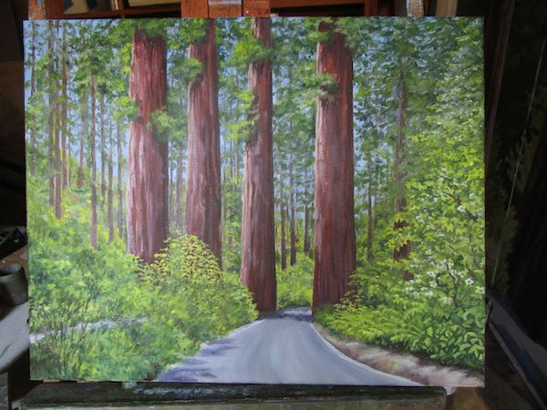
The downhill lane isn’t convincing, the leafy bush/tree over Guardsman #2 is too yellow and looks like a cultivated roundie-moundie, and the growies in that center lane are too mushy.
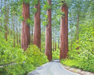
All better now.
What’s wrong with this picture?

The downhill lane isn’t convincing, the leafy bush/tree over Guardsman #2 is too yellow and looks like a cultivated roundie-moundie, and the growies in that center lane are too mushy.

All better now.
When it is hot (i.e. “summer”), I prefer to paint in little stages rather than in long sessions. The swamp cooler helps, but it isn’t A/C for sure and for certain.
This might be how it looked last time you saw it. “It” has the working title of “Keep Right”, and I am open to suggestions, because I don’t want to paint the sign that says “Keep Right”, which belongs on the lower left.
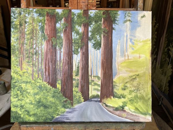
I didn’t show the steps between the photo above and the one below. Sometime after I thought it was moving in the right direction, I put another layer of sky over everything in the background. It was a little alarming, and I didn’t take a photo. After it dried, I redid the distant tree trunks, and rebuilt the greens back there. Then I moved to the foreground on the right side.
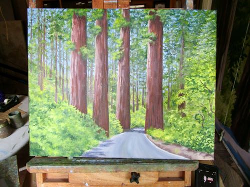
I was working from a terrible photo that I took through the windshield and then cropped vertically. When I started the painting, I changed my mind and started it as a horizontal painting. This meant that I set aside the printed photo and switched to the terrible one on my laptop. Aha! I see the downhill lane on the left! Now I needed to rearrange things to make sense instead of just slapping lots of greenery on the unknown spaces.
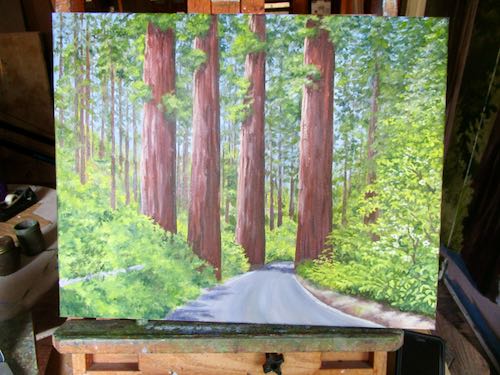
Something might be different in this photo but I can’t quite tell.
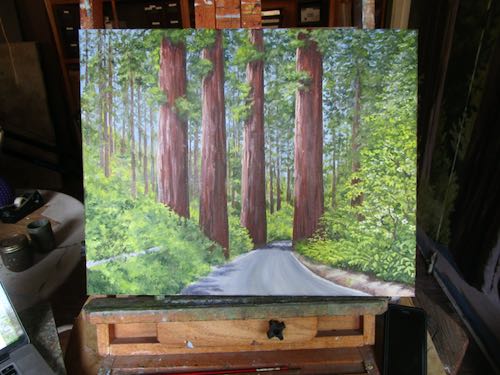
I took this last photo when I was tired of being hot.

There is more work to do, but it is beginning to look believable.
The Art World in general looks down on studio artists who work from photos. I mention this from time to time, because the notion that working from photos is wrong bothers me.
In order to work from my photographs, I have to find the scenes, find the best angles, light, and cropping. The photos go on the computer for editing. It takes time and thought to decide which might be worth painting and how many different photos to combine to have all the angles and details needed.
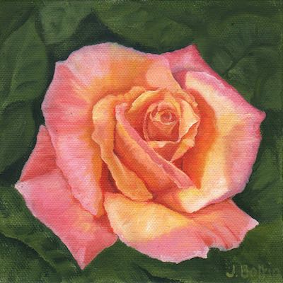
It is a rare instance when a single photo tells the whole story. This is why I loved painting “Rose” —a single photo, easy to understand textures, forgiving colors, specific shapes. Sometimes I need an easy project to rebuild confidence.
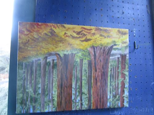
A friend took a photo while hiking. She recognized the subject and textures and light as something I might like to paint. She was right, and generously sent the picture to me.
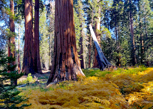
That leaning tree had to go. Easy enough, but without it (and even with it), the photo felt unbalanced, with all the redwood trees on the left. As beautiful as the yellow ferns are on the bottom, they just didn’t quite seem balanced to me. I cropped in various ways, and chose this:
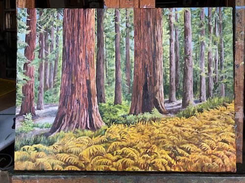
As much as I wanted to just copy the photo, I cannot. This is not “cannot” as in “I cannot tell a lie” —it is “cannot” as in I lack the ability. The background greenery is too mushy and vague while the ferns are far too many and far too detailed. I think painters are supposed to interpret the photos, using their own abilities and opinions to show something that will ALWAYS be better in person (both the actual scene and the painting).
This painting is about three main elements: the sequoia trees, the golden ferns, and of course, the light. It is 12×16″, titled “Below Panther Gap”. Or maybe “On the Way to Panther Gap”, or “Somewhere Below Panther Gap”.
So many decisions to be made. At least I have settled the decision whether or not to feel guilty about painting from photos.
Practice Painting? Painting Practice? Paint Practicing?
Never mind. Doctors practice medicine, attorneys practice law, and this artist practices painting. Some days I feel as if I am brand new, with no idea how to tackle a subject. Some days I think I’m figuring it out. Only once in awhile does the process feel easy.
I have a solo show coming up a year from now, and I want to be ready. No last-minute panic painting, just a well-planned body of work that is cohesive, looks good together, represents my best efforts, and most of all, represents the best parts of Central California, specifically Tulare County. Or perhaps is the best representation of Tulare County, a place of superlatives, both great and terrible.
Hey Central California, stop your bloviations and show us some work.
Ahem. Would you like to see what I was practicing on?
About time.
I started with more detailing on the trees.
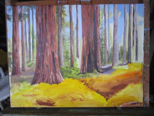
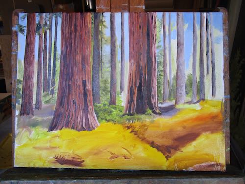
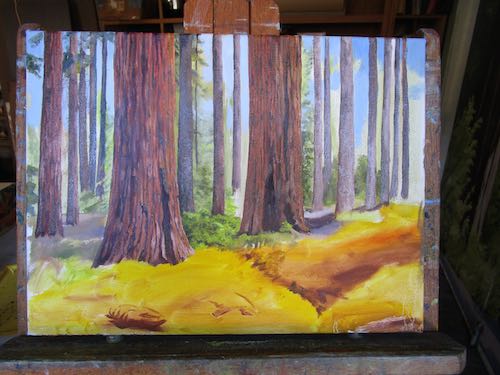
Then it was time to work on the background. All those vague and messy branches and clumps of needles were a bit confounding, but that’s okay, because I was just practicing. It helped to put in the sunlit strips of ground.
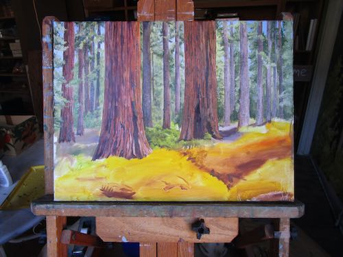
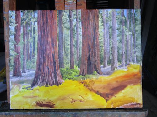
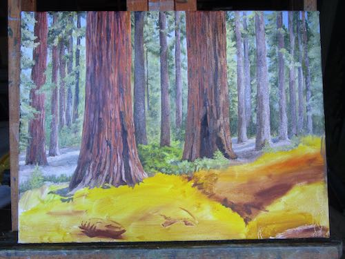
I had to turn the canvas sideways in order to place the tip of my brush WHICH I WAS DRAWING WITH, SO THERE, in the right place to get accuracy. In order to paint those ferns in detail, I DRAW WITH MY PAINTBRUSH.
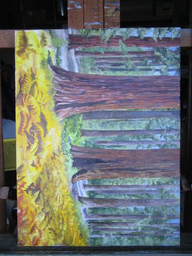
Finally, I hung it on the wall to dry, and that’s when I realized I had begun the scene upside down but hadn’t actually reversed the canvas. Oh well. A wire is easy to move.
The Great Western Divide is the name given to the ridge of peaks seen from the top of Moro Rock in the Sierra Nevada. On this side, water drains west and on the other side, it drains east .
I haven’t painted this before, at least not from this view. The mountains show in the distance of many of my citrus/foothills/mountain scenes, but only once did I try to make them perfect. And that was tricky, because I worked from many photos, piecing the range together, and then faking the hills.
Why did I fake the hills? Because they were different in every single photo, because each photo was taken from a different place. There is no place besides an aircraft where you can see the entire width of the Sierra Nevada.
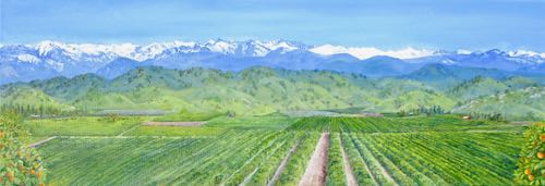
Here we go. . .
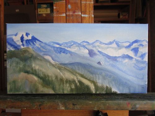
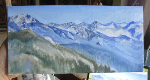
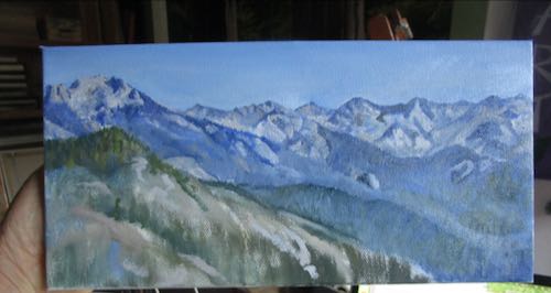
At the end of the painting session, the light was a bit too low to be accurate on both the colors and the shapes.
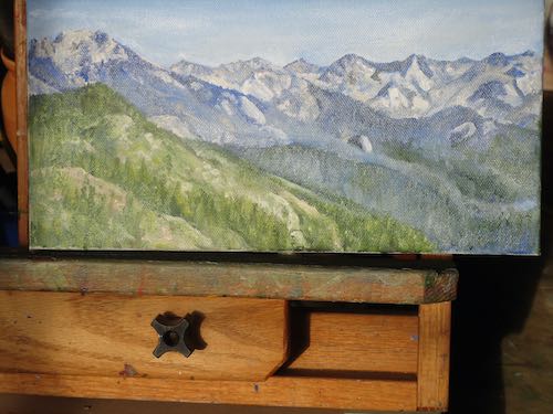
So, I photographed it the next morning in the bright sunlight. Looks washed out because the wet paint is reflective.
When it is dry, I will scan it, and then, as always, I will tell you it looks better in person.
The Great Western Divide, oil on wrapped canvas, 6×12″, $125.
The ArtSpeak word for slowly building paintings with layers is “glazing”. You’re welcome.
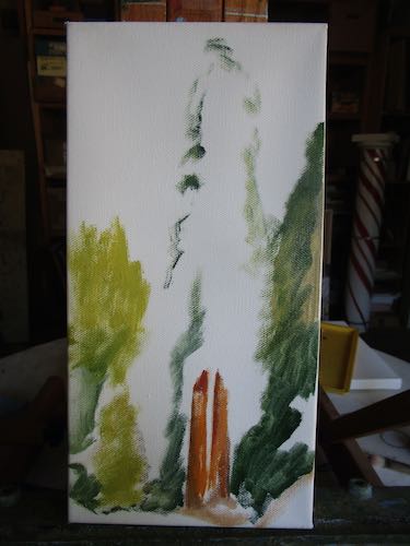
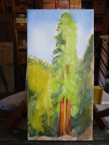
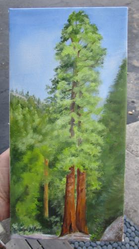
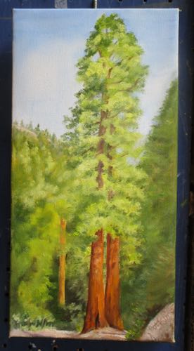
This might be finished. The photo on the left was taken in the afternoon; the one on the right was taken the next morning. I’m hard-pressed to tell you which is more accurate.
Why, yes, indeed it is.
Wait, nope, I spent yet another hour on the phone with someone whose main phrase was, “Yes Ma’am”, as she tried to figure out AGAIN why my new phone won’t work. Or wait, is it the new SIM card? Perhaps it is the new provider?
See a pattern here? It is the word “new”.
STOP WITH THE CHANGES AND UPGRADES AND UPDATES ALREADY!!
Okay, where were we. . . oh yes, in the day’s accomplishments and forward progress at the easels.
Neither of these paintings are finished, but they are both much closer than the last time you saw them.
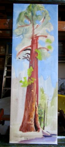
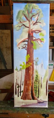
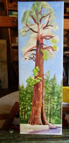
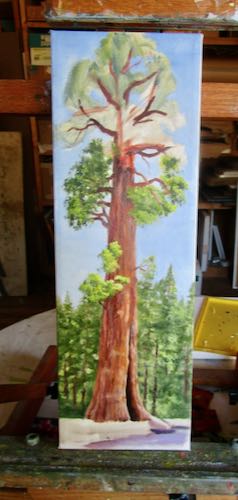
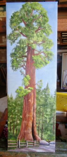
That Sequoia is called the Sentinel Tree and it is in front of the building formerly known as the Giant Forest Market. Now it is the Giant Forest Museum.
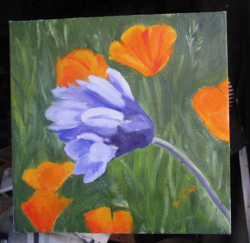
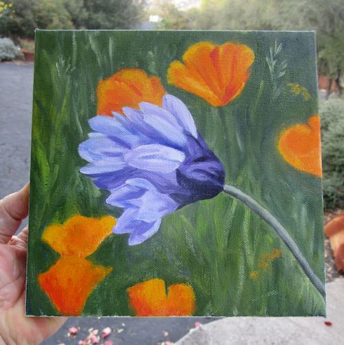
The difficult thing about this commission wildflower piece is keeping the edges of the poppies slightly blurry so that the brodiaea AKA Blue Dick really jumps out.
I love this kind of detailed realism, even if it does take (almost) all day. And both of these subjects are exactly what one would expect from a Central California artist. All that is missing is some oranges.
Hmmm, I am sort of like country music with my three subjects: redwood trees, poppies, and citrus. (Country music’s three subjects are cheatin’, drinkin’, and storytellin’.)
Wait, I also paint Mineral King, cabins, single oranges, entire groves, the foothills with mountains in the background, various views of the Sierra Nevada, Three Rivers, and whatever else people are interested in hiring me to paint.
Phew. Thought for a moment I was gittin’ real simple-like.
See? I did more than just be on hold and paint. . . I did me some thinkin’. Real high-quality thought.
If you can’t see the photos, go here: cabinart.net/blog.
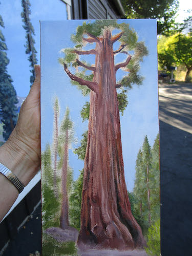
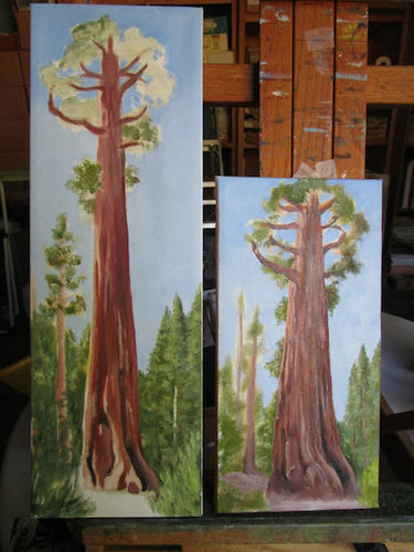
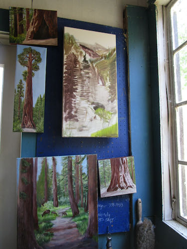
Hi Pippin! I hate it when you have a campout, but at least you are camouflaged pretty well in the non-spring months.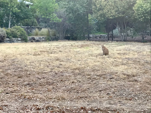
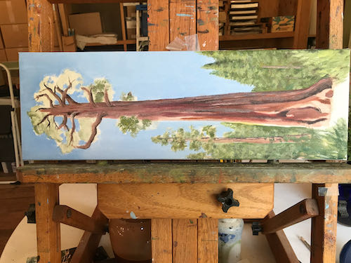
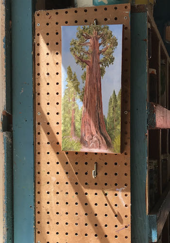
Couldn’t think of anything to say about today’s paintings except that I might have enough sequoia/redwood/big tree paintings for a little while. Might have had a bit too much fun at the class reunion (Redwood High School, Visalia, Class of ’77) to be very articulate. (No, I don’t drink, but lack of sleep has similar outcomes of stupidity and dull-wittedness).
If you can’t see the photos, go here: cabinart.net/blog.
Sequoia, Big Tree, or Redwood?
All three work.
Redwood High School class of ’77 45th reunion is this weekend. So few people are attending that it was moved to a smaller location (no, not Goshen or Farmersville or Ivanhoe). I will be attending because many people travel great distances to go, and it would be quite rude if I couldn’t be bothered to go 35 miles to Visalia. Besides, maybe someone will show up who likes and then buys my work. “Networking”, I think it is called. Now, back to production.
Three paintings are now completed and ready for display and sale at Kaweah Arts in Three Rivers.
In the Big Trees, 8×10″, oil on wrapped canvas, $125 (plus Calif. sales tax)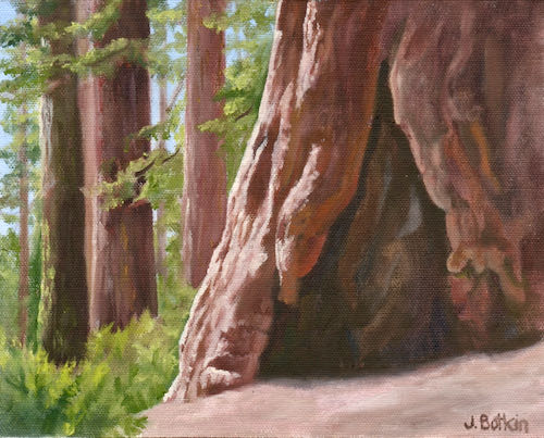
Sequoia, 8×8″, oil on wrapped canvas, $100 (plus you know)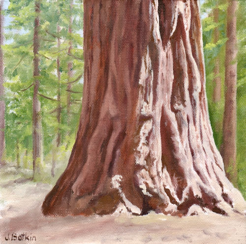
Big Tree, 6×6″, oil on wrapped canvas, $65 (plus. . . sigh.)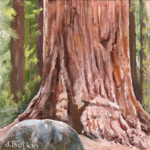
Finding titles for these pieces is quite the chore. Painting them is easy, because now I have enough experience that I can make them up, using a photo just to get a clue.
First, something has gone wonky with my blog so the blog post title either doesn’t show at all or it is a little bit messed up.
“On a clear day” what? It certainly isn’t “you can see forever”. Last Wednesday, this is how things looked.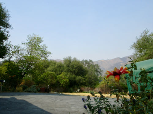
No, really, look! You can see the hills across the canyon, and the helicopters resumed flying to the fires.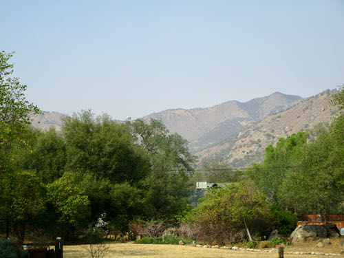
This doesn’t qualify as a clear day in the olden days before wildfires ruled our corner of the world, but it qualifies as light enough to paint, and not smoky either, so I could paint with the doors opened up.
Remember this painting? I can’t even remember what I titled it anymore, but I do remember it is my favorite type of scene to paint, and that it was lacking wind machines, oranges, and a signature. We last saw it here on September 13.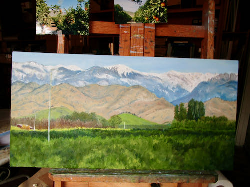
Now it is completed.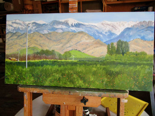
Even with the doors open and a clear(ish) day, it doesn’t photograph all that well. How about if I prop it up on the ladder so you can further appreciate the completion?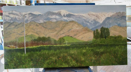
Okay, standard disclaimer: it looks much better in person.
Next!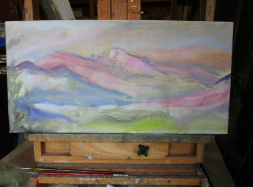 Remember this? Of course not. Why would you? You last saw it on August 19.
Here I have begun adding sky, a color blue that I had almost forgotten to associate with looking up.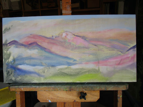
It now needs another coat, and then the detailing, my favorite part of drawing with my paintbrushes.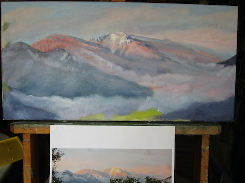
I wonder how Alta Peak and Moro Rock–wait! Moro Rock doesn’t really show in this painting because it doesn’t really show in the photograph I’m using, so I might have to revisit this.
Where was I?
Oh. I was wondering how this view will look after (when? if?) this horrible fire ever ceases. It will have to run out of fuel eventually. Will this affect how sunsets look in the winter? Will we have winter?
Never mind. Let’s all just sing a happy little version of “It’s a Small World After All”, because the colors on my painting bring that song to mind.
You’re welcome.
P.S. 35 years ago today my life changed forever, for which I am very thankful.