HAPPY BIRTHDAY, TAMMIE!
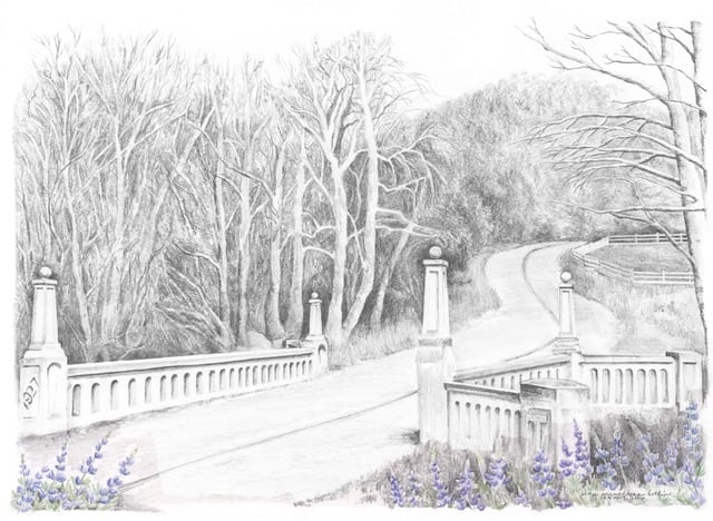
Last week I took a small stack of pencil drawings to a framer because I have a show coming in the spring. As I was lining them out on his counter, I decided that there is something wrong with this picture. It isn’t anything I can put my finger on; I just don’t think it is good enough and I don’t know why.

One of the things I teach my drawing students is honest evaluations of drawings. We tell each other the truth (kindly, of course) because it is how we learn and grow. It is too hard to find flaws in one’s own work, just like it is impossible to proof one’s own writing.
This is what I heard:
- not enough darks
- weird road curve into the distance
- something wrong with the shoulder of the road
- edges of bridge arches too clean – should be more pock-marked for its age
- furthest pillars wrong size
I thought about just shredding the drawing. Please forgive me for inflicting this on those of you who bought a calendar – try to be brave through the month of February. At least it is the shortest month!
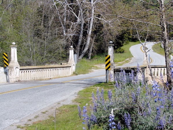
Then I thought that seeing the photos might help us all understand.

I actually worked from 3 photos, picking and choosing the best and most visible parts of each.
This sort of dissatisfying result is probably because I worked from photos instead of standing there on location with a sketchbook. Of course, then I might have gotten run over, bitten by a rattlesnake or a mosquito with a nasty disease, gotten too hot or too cold or sunburned or maybe bugs would have landed on my paper or the wind might have blown it away.
I hate it when that happens.
Will I try to figure it out and rework the drawing? Probably not. I used spray fixative (actually called “Fixatif”, which on of my drawing students says ought to work on any marriage!) which makes it not erasable.
8 Comments
What struck me as odd when viewing this drawing was that there was a so-called “tangent”, where the pillar on the right intersected with the road centerline and drew my eye to it. Seems like it would be better to not have these two lines connect. In the photo the tree sucker limb comes up and hides the back pillar so that is not seen. A nice setup for a drawing, hope you can fix it.
Connie, that is interesting and something no one else has brought up. The drawing is currently in a drawer where it can just stay for awhile.
Oh no! Not the shredder! Give it some time …
Diane, I’ll toss it in a drawer just in case I get bored some day and want to redeem it.
I looked at the drawing before I did the reading and thought the first pillar on the right side of the road looked off … third pillar if one counts left to right … does that make sense?
Thanks Diane – nothing a little session with a paper shredder can’t fix! 😎
I agree with “not enough darks”. There isn’t enough definition. It’s all pretty much the same value. Also, the barrier on the far (left) side of the road slopes down more in your drawing than in the photo. Tree trunks on the far side of the road are too white and the depths of the forest in the photo are so dark that they give the feeling of mysteriousness but not so in the drawing. The pillars on the bridge are too clean and the right railing are too clean. You quit before you were finished…ok, that’s it…remember, you asked! 🙂
Excellent, Nikki! Thank you! I still don’t think I’ll do anything else with it except maybe run it through the shredder.
Comments are closed for this article!